


项目已开源,欢迎使用与分享:https://github.com/Red-Asuka/vitepress-plugin-tabs
想了解实现思路与方法,可以继续阅读下文。
为什么需要 tabs 功能
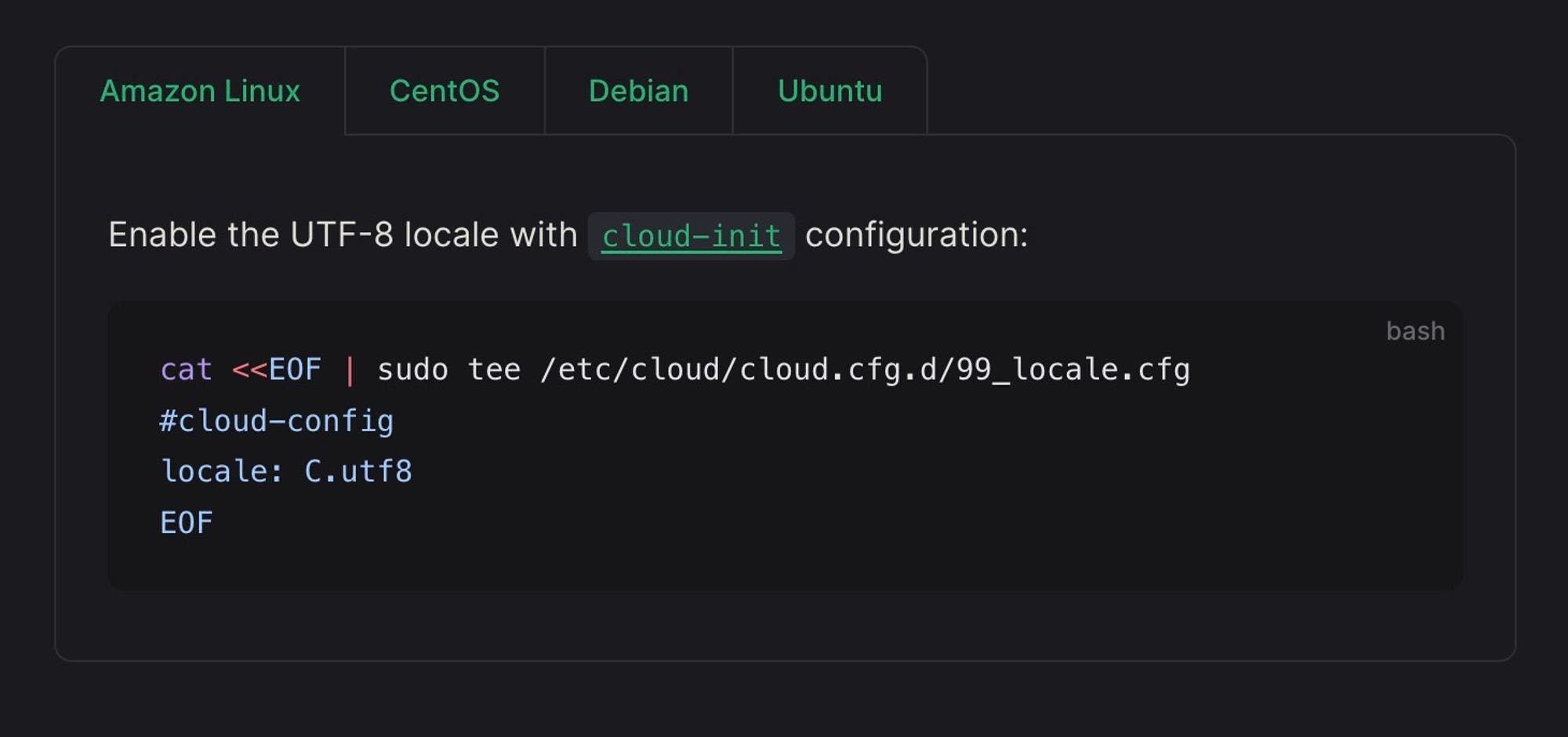
Vitepress 的 Markdown 扩展支持代码组功能,能够对多个代码进行分组,这方便展示和切换不同类型的代码。
::: code-group

```js [config.js]
/**
 * @type {import('vitepress').UserConfig}
 */
const config = {
  // ...
}

export default config
```

```ts [config.ts]
import type { UserConfig } from 'vitepress'

const config: UserConfig = {
  // ...
}

export default config
```

:::

但这种使用方式有一定的局限性,只能对代码进行分组,无法放入其他内容,特别是当一组代码中的不同代码需要添加一些介绍和提示等内容时。
实现思路
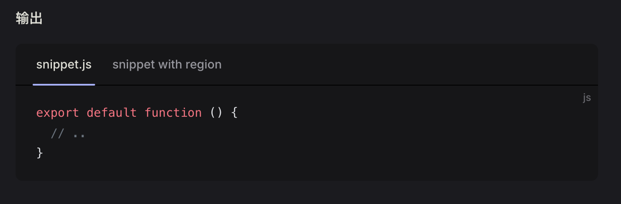
在简单查阅文档后,我发现 Vitepress 能够在 Markdown 中使用 Vue,也就是说我们能够写一个 tabs 组件来实现此功能,类似这样:
<script setup>
import CustomTabs from '../../components/CustomTabs.vue'
import CustomTab from '../../components/CustomTab.vue'
</script>

# Docs

This is a .md using a custom component

<CustomTabs>
	<CustomTab>
		First Tab
	</CustomTab>
	<CustomTab>
		Second Tab
	</CustomTab>
</CustomTabs>

## More docs

...
但这需要导入组件并以 Vue 组件的方式来使用,对非前端开发者来说不太方便。
那么能否像官方提供的代码组功能一样,不需要手动引入组件也能实现呢?
继续翻阅文档,我发现 Vitepress 介绍了其使用了 markdown-it 作为 Markdown 渲染器。上面提到的很多扩展功能都是通过自定义插件实现的,并且允许用户来自定义扩展。
通过查看 Vitepress 源码发现其代码组功能实际上就是通过 markdown-it-container 来实现的。这个插件能够创建块容器,并指定他们应该如何去呈现。通过其去注册自定义容器,并将其呈现为 Vue 组件,这样就能通过组件去渲染内容了。
实现过程
原理清楚后我们就来实现一下,首先定义一些工具函数用于处理 tab、tabs 组件的属性:
// /plugin-tabs/util.ts

// Map to keep track of used ids
const tabIds = new Map()

export function dedupeId(id: string) {
  const normalizedId = String(id).toLowerCase().replace(' ', '-')
  const currentValue = !tabIds.has(normalizedId) ? 1 : (tabIds.get(normalizedId) + 1)
  tabIds.set(normalizedId, currentValue)

  return `${normalizedId}-${currentValue}`
}

function mergeDuplicatesName(arr: string[]) {
  const nameArr = arr.filter(item => item.startsWith('name'))

  if (nameArr.length <= 1)
    return arr

  let newName = ''
  nameArr.forEach((item) => {
    newName += `${item.replace(/name="(.+?)"/, '$1')} `
  })
  newName = `name="${newName.trim()}"`

  const newArr = arr.filter(item => !item.startsWith('name'))
  newArr.unshift(newName)

  return newArr
}

export function tabAttributes(val: string, options: any = {}) {
  let attributes = val
    // sanitize input
    .trim()
    .slice('tab'.length)
    .trim()
    // parse into array
    .split(/ +(?=(?:(?:[^"]*"){2})*[^"]*$)/g)
    // normalize name attribute
    .map((attr: string) => {
      if (!attr.includes('=')) {
        if (!attr.startsWith('"'))
          attr = `"${attr}`

        if (!attr.endsWith('"'))
          attr = `${attr}"`

        return `name=${attr}`
      }

      return attr
    })

  attributes = mergeDuplicatesName(attributes)

  if (options.dedupeIds) {
    const idIndex = attributes.findIndex((attr: string) => attr.startsWith('id='))
    const nameIndex = attributes.findIndex((attr: string) => attr.startsWith('name='))

    if (idIndex !== -1) {
      const id = attributes[idIndex]
      const [, idValue] = id.split('=')
      attributes[idIndex] = `id="${dedupeId(idValue.substring(1, idValue.length - 1))}"`
    }
    else {
      const name = attributes[nameIndex]
      const [, nameValue] = name.split('=')
      attributes.unshift(`id="${dedupeId(nameValue.substring(1, nameValue.length - 1))}"`)
    }
  }

  return attributes.join(' ')
}

export function tabsAttributes(val: string) {
  return (
    val
      // sanitize input
      .trim()
      .slice('tabs'.length)
      .trim()
  )
}

export function defaultTabsAttributes(attributes: { [x: string]: any }) {
  const attributesString = []
  if (!attributes || Object.keys(attributes).length === 0)
    return ''

  for (const key in attributes) {
    const substring = `:${key}='${JSON.stringify(attributes[key])}'`
    attributesString.push(substring)
  }

  return attributesString.join(' ')
}
编写 tab、tabs 自定义容器的函数:
// /plugin-tabs/tab.ts
import container from 'markdown-it-container'
import type Token from 'markdown-it/lib/token'
import type MarkdownIt from 'markdown-it'
import { tabAttributes } from './util'

export default (md: MarkdownIt, options: any) => {
  md.use(container, 'tab', {
    render: (tokens: Token[], idx: number) => {
      const token = tokens[idx]
      const attributes = tabAttributes(token.info, options)

      if (token.nesting === 1)
        return `<tab ${attributes}>\n`

      else
        return '</tab>\n'
    },
  })
}
// /plugin-tabs/tabs.ts
import container from 'markdown-it-container'
import type Token from 'markdown-it/lib/token'
import type MarkdownIt from 'markdown-it'
import { defaultTabsAttributes, tabsAttributes } from './util'

export default (md: MarkdownIt, options: { tabsAttributes: any }) => {
  md.use(container, 'tabs', {
    render: (tokens: Token[], idx: number) => {
      const token = tokens[idx]
      const defaultAttributes = defaultTabsAttributes(options.tabsAttributes)
      const attributes = tabsAttributes (token.info)

      if (token.nesting === 1)
        return `<tabs ${defaultAttributes} ${attributes}>\n`

      else
        return '</tabs>\n'
    },
  })
}
再来编写一个用于注册插件的方法:
// /plugin-tabs/index.ts
import type MarkdownIt from 'markdown-it'
import tabs from './tabs'
import tab from './tab'

function tabsPlugin(md: MarkdownIt, opts: any = {}) {
  const defaultOptions = { dedupeIds: false }
  const options = Object.assign({}, defaultOptions, opts)

  tabs(md, options)
  tab(md, options)
}

export default tabsPlugin
在 .vitepress/config.ts 中去注册插件:
import tabsPlugin from './plugin-tabs/index'

export default {
  // ...
  markdown: {
    config: (md) => {
      tabsPlugin(md)
    },
  }
}
这里我们直接去对接一个开源的 Vue3 tabs 组件 vue3-tabs-component,首先先安装依赖:
pnpm i -D vue3-tabs-component
编写 tabs 的样式:
// /plugin-tabs/style.css

.tabs-component {
  margin: 32px 0;
}
.tabs-component .tabs-component-tabs {
  display: inline-flex;
  margin-top: 0;
  margin-bottom: -1px;
  padding: 0;
  border: 1px solid var(--vp-c-divider);
  border-bottom: none;
  border-radius: 8px 8px 0 0;
}
.tabs-component .tabs-component-tabs .tabs-component-tab {
  margin: 0;
  color: var(--vp-c-brand);
  font-size: 14px;
  font-weight: 600;
  list-style: none;
  border-left: 1px solid var(--vp-c-divider);
  border-bottom: 1px solid transparent;
}
.tabs-component .tabs-component-tabs .tabs-component-tab:first-child {
  border-left: none;
}
.tabs-component .tabs-component-tabs .tabs-component-tab.is-active {
  border-bottom-color: var(--vp-c-bg);
}
.tabs-component .tabs-component-tabs .tabs-component-tab .tabs-component-tab-a {
  display: flex;
  align-items: center;
  padding: 8px 20px;
  text-decoration: none;
}
.tabs-component .tabs-component-panels {
  padding: 16px 24px;
  border: 1px solid var(--vp-c-divider);
  border-radius: 0 8px 8px 8px;
}
在 .vitepress/theme/index.ts 中注册全局组件,并引入我们自定义的样式:
import { Tab, Tabs } from 'vue3-tabs-component'
import './plugin-tabs/style.css'

export default {
  // ...
  enhanceApp({ app }) {
    app.component('Tab', Tab)
    app.component('Tabs', Tabs)
  }
}
测试
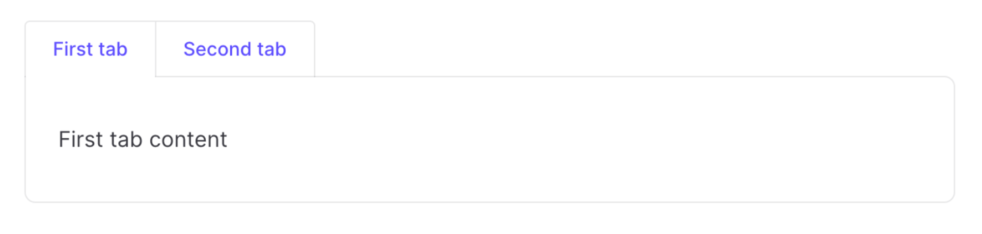
让我们来实际测试下,随便找个 markdown 文件,粘贴以下内容:
:::: tabs

::: tab First tab

First tab content

:::

::: tab Second tab

Second tab content

:::

::::
实际渲染效果如下:

由于使用了开源的 tabs 组件,通过对参数处理,组件还能提供一些配置功能,例如设置 tab id,默认选择的 tab 等,更多使用方式参考:https://github.com/Red-Asuka/vitepress-plugin-tabs?tab=readme-ov-file#usage
到这就大功告成了,看着效果还是不错的。
我整理了下代码放到了 GitHub,并发布了 npm 包,欢迎大家使用。